TruLocal
Objective:
The mission was to deliver a technology solution that provides local retailers with an entirely new marketing channel, robust digital capabilities, and a scalable process to connect with consumers within their communities. Through TruLocal’s marketplace, consumers find what they want in local inventories, comparison shop conveniently, and choose to pick-up purchases or have them delivered on the same day. As a result, consumers get the products they want with the same convenience and safety that they are used to, and their dollars are spent at small businesses that create local jobs, boost their local economies, and make up the unique fabric of their communities.
Results:
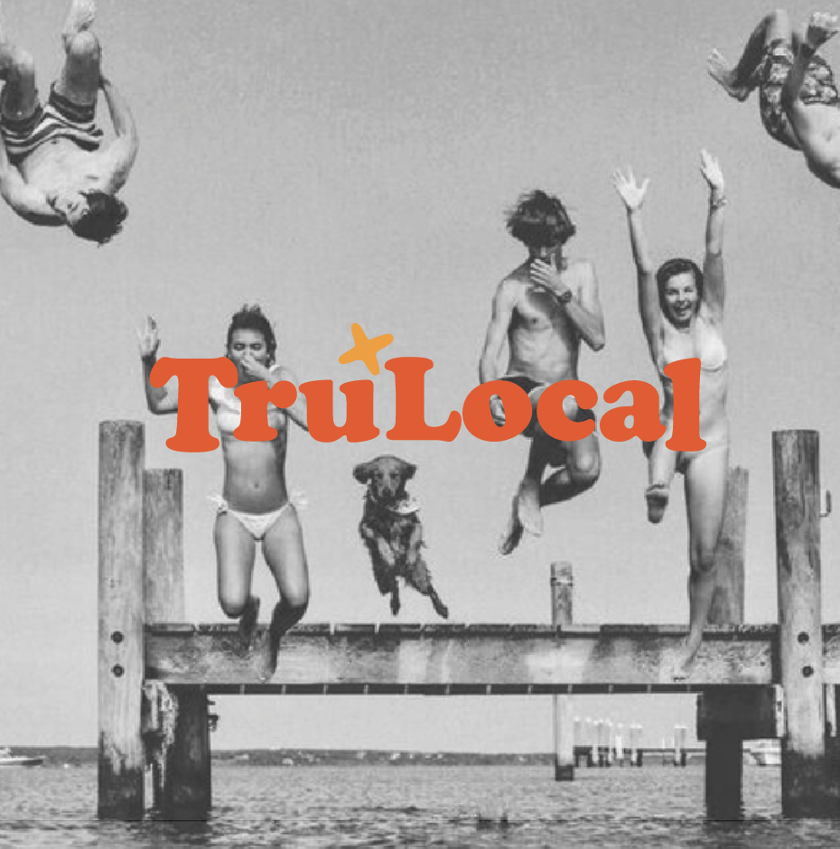
Kelsey was brought on as a consulting ECD to deliver primary branding and full visual expression, oversee UX design and deliver a comprehensive brand guidelines and content strategy. The TruLocal branding was developed with the ‘local’ in mind, wherever that local may be. Connecting shoppers to products immediately through tech makes lives easier while also supporting community, which is a very honorable task in many small towns and older, smaller urban centers in America. The branding and guidelines were developed to enforce the 3 brand pillars of being locally responsible, innovating for the local customer and retailer, and simplifying the complicated. The TruLocal name was already established, so Kelsey developed a full logo suite with multiple versions and stacks. The typeface for the wordmark, Cooper Black, was chosen intentionally to harken back to the days of small town signage and ringer t’s, made modern through a vibrant gradient palette and proprietary tech. The small ‘star’ icon is meant to be interpreted as an X on a map, like X marks the spot, pulling a map concept into the logo to reiterate locality. When pulled out as a stand alone icon, the mark also looks like a “t”, for TruLocal. The result is a friendly and flexible suite of logos for the tech brand.